
Topic Four: Spreadsheets & Data Analysis
In this topic we are exploring data. We can sort and edit data using spreadsheets. A spreadsheet is a table that can do calculations automatically, they can sort data and make it easier to interpret information from a set of data using graphs and charts. Here is an example of an infographic that displays data in a graphically interesting way.
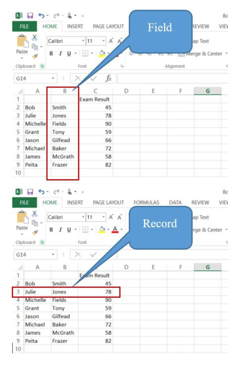
When we put data into a spreadsheet we organise it into columns (vertical) and rows (horizontal). In the tables below you can see that the B column is identified as a FIELD. A field in the case of the table below is something that identifies each part of the table: example: First Name, Surname and Exam Result. In the second table you can see an arrow highlighted and identified as a RECORD. A record holds data from each field and describes a person or thing
We now can start using some of the automated features of Excel to manipulate our data. We can sort our records by the exam results to find out who had the highest results nad who had the lowest.
Select the Column Header C to grey out the C column. The select the SORT & FILTER button.
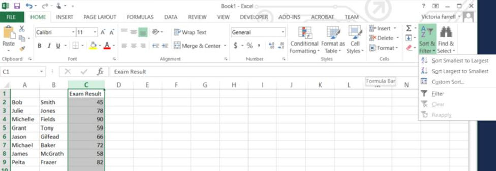
We now can now select "Sort Largest to Smallest" and it will ask you if you want to "expand the Slection". This measn it will organise the all the records (rows) into order. Make sure it is selected and you should have the following outcome.

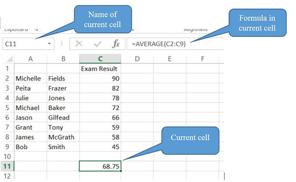
Now we can do a calculation to find the AVERAGE result.
We need to select a cell where the average results is going to be displayed. Let's choose C11 in this case.
To add a formula, you must always start with an equals sign =.
We need to write:
=average(C2:C9)
When you press "enter" it will calculate the average result int he RANGE of cells from C2 to C9.
DATA ANALYSIS
Let's find some data to analyse. There are plenty of data sets availabel online for students to download and analyse.
Data Sets:
First we need to find something interesting to explore. This example will explore weather data in Melbourne using the Australian Bereau of Meterology site. Each website has a different way of accessing the data. Ask your teacher for assistance if you can no use copy and paste techniques to access the data in your excel file.
On the Bureau of Meterology site I browsed till I found the Data Services Weather Station Directory and entered Mebourne and the type of data I wanted, which was maximum monthly temperatures.


Once I found the data download options I chose the Melbourne Olympic Park data.

At this point I can copy and paste the table of data into my excel spreadsheet.

Once the data is in excel I can start to use formulas. In the table below you can see the active cell B12 has a formula that is calculating the average values January.

To create a graph from the data we need to ensure the data has field and record names. In the table belwo you can see I have added Jan - Dec in the row above and In A11 and A12 I have name was the data is in the rows as Months and Average Maximum Temperature.
I highlighted Cell A11 to cell M12 and Selected INSERT then the line graph to get excel to automatically create a line graph that shows how temperatures fluctuate throughout the year.

You may choose a different data to investigate and the nature of the data will dictate how you will use the excel spreadsheet to analye it.
CHARTS & GRAPHS
it is important that you use the correct graph type for the data you are using. This website take you through an overview of differnt charts and graphs and when to use them. Here is a brief overview:
-
Pie Charts: When you are using percentages.
-
Column Charts: When you are making comparisons
-
Line Charts: when you are charting change over time
INFOGRAPHICS
Infographics are great for communicating complex information. They may contain:
-
Brief text
-
icons
-
lines to group and separate areas of the graphic into different ideas
-
Limited number of colours
You can see the two infograhics below as two very nice examples. Try typing "infographic" into google and select IMAGES. You will see hundreds of examples.


There are many ways to create an infographic. You can use Word, PowerPoint, Photoshop, Illustrator or one of the many online infographic tools. This website lists 13 different online tools you can choose from.
Below I have put together an infographic from the data I collected from the Bureau of Meterology. I used a free online infographic tool called VISME.
FEATURES OF AN INFOGRAPHIC
-
Clear Headings
-
Icons that are easily identifyable.
-
Identified key facts or figures
-
Graphics that link information
-
Graph contains a clear heading
-
Graph contains a key
